scratch that last post. my tutors shot down the idea of using blood as a medium due to them being "concerned about the obvious health concerns".
really thought they would be more for boundary pushing but hey. I'll just have to store this idea until they aren't liable for my well-being.
back to ink I guess.

Tuesday, 1 December 2015
Sunday, 29 November 2015
this is going to sound weird
so things are going to get quite interesting now. I've decided to use my own blood as a medium. being an animation about blood cancer I feel this will add a whole new depth to the work and really make it mean something. if I cant have a personalized character then i think this is probably the best way to make the piece truly mine.
the main problems i'm currently trying to figure out a way around are:
being an animation this is going to tale a LOT of blood and i'm unsure how much I can safely extract.
blood clots after it leaves the body so i'm going to need a way to keep it liquid.
obvious health and safety concerns of working with a hazardous material.
never having used blood, this will take some getting used to.
finding a way to safely get the blood out without risking my own health.
Friday, 27 November 2015
hand in
so the hand in is today and I thought I would share some final thoughts on the project.
while i'm very happy with the way its heading; I would like to add more detail to the final character design as looking back i think in my quest to make it more relate-able, I have oversimplified the character a tad.
I love the storyboard tho, while I haven't published it, due to it being basically stick-men, it great tp have the fleshed out script.
-things to do in the FMP
- touch up character
- find fair used music
- animate
- make publishable storyboard and animatic
sketch dump
while I still believe I have some final polishing to do in the FMP. I am happy with the final look of the character. by increasing the use of symbolism I was able to give the project even more depth and purpose.


first idea silhouetted


then I thought of using mannequins as they are made to look like the idea every-man.
the biggest problem was that my character needed hair and mannequins generally dont have that

I quite liked the artist doll and fire look, but i felt it would lend more to a stop motion than animation, and like the mannequin there is no hair

I decided to pursue the silhouette idea
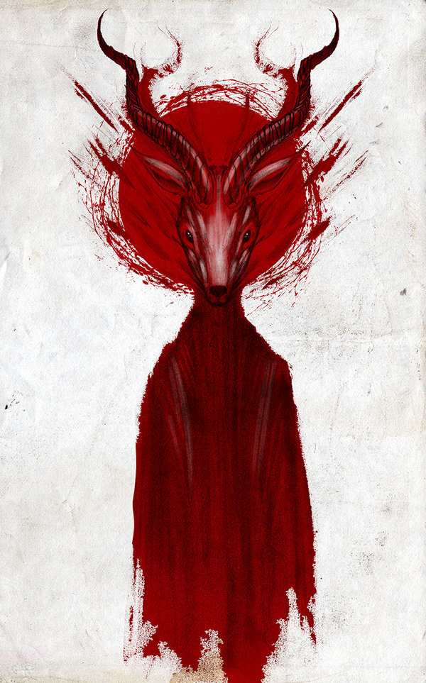
the real turning point was when I saw this image by Shaun Coss. when I thought it looked like it was made of blood the epiphany struck. Symbolizing the blood cancer like this would add a whole new layer of meaning and depth to the character design.


over all I am very happy with the final look of the character and I look forward to carrying it on through the FMP
thoughts
so here is the rest of the character development. everything got a lot more difficult after the critique, making the changes the lecturers suggested.
after trying several different ways of restyling the character I finally found one I was happy with.
making the choice to focus on the stylistic development and ditch the test animation idea was a difficult one; I could have done some tests with a character i wasn't happy with and hadn't developed enough, but instead I decided to put all my effort into getting it right.
although that derision may reduce my final grade for this project. im happy with the choice I made, due to the fact this project is leading directly into the FMP, I feel I made the wise decision to get the most important aspect done instead of wasting time animating a character I wasn't going to use.
so without further adue, here is the rest of the sketchbooks.
Sunday, 8 November 2015
critique
update--
in our critique, my animation was generally well revived. it has however been suggested to me that I slightly modify my character design, as I molded it on my old self, I had no trouble connecting to this very personal character. As my tutors rightly pointed out this wouldn't be the same for everyone. we have agreed that I will make the character more silhouetted and less personal so as to reach a greater audience.
to do this I need to change the characters hair and colour properties to something less like myself that is more relate-able for a wider audience.
I quite agree with this dissension, as I think that even though it is a very personal story I am dealing with, that doesn't mean the animation has to be just for me. it was a somewhat pinhole vision of my narrative, and while I could easily relate to a character biased on myself, a wider context needs to be taken into account.
Tuesday, 3 November 2015
character design 2
It's now time to start getting the basics down, I create my character first in full as it is in my head, then I refine its segments piece by piece until I am happy with the general design. after this I start to delicately draw the character in full and rectify any bits i'm not happy with. for me this is the most important part of any project, being a picky person, I need to have the character done to a standard i'm happy with, otherwise i would most likely stop what i'm doing further down the process, fix what i'm unhappy with, and then have to redo all the after, or continue whilst unhappy and not be able to focus on the final product causing further delays.
this is a process I have been developing throughout my time at uni, I have learnt how I best work through trial and error. finding how you work to the utmost efficiency is built on many mistakes. mainly in my first year I found I ran out of time on projects because I spent too much time on this part, or not enough and wasted time fixing it. it is a fragile balance that I am still working on in my professional practice.
this was the first real image I drew, to get visual indication of what style I was going to use.


even this very quick drawing helps me to visualize what i want the animation to look like.
to be sure I am producing the best work I can, constant experimentation is necessary, any random idea could snowball into a key aspect of the piece


then I start experimenting and refining any traits i'm not sure of, the hair in this case. I experimented with different styles, colours, and techniques until I found one I was happy with.


now it was time to draw a full version of the character so that I could see the culmination of the experimentation so far. I chose to focus on the start and middle of the characters change to better see the contrast and visualise the development from A to B,


At this point I wasn't particularly happy with the way the jeans looked, so I took them back to the drawing bored and experimented some more.

to better see the change that would occur I did some sketches from photos of myself before and during chemo. these again rough sketches help me to see the change in shape and form


influences
the main design influences for this project are the works of Russ Mill, Shawn Coss and to a lesser extent I also am influenced by the work of Anja Uhren, whose lecture I was lucky enough to attend, and studio Ghibli's the Tale of Princess Kaguya.
I love how Russ Mills captured emotion in his illustrations, by using the jagged strokes and limited colour palette, it lends a certain instability to the forms of his models. this is one of the techniques i also plan to use.


these are the images I find most stylistically influential, I will be using a similar method to show the emotional turmoil and loss of self the character experiences as time progresses
On the other hand Shawn Cosses series of faceless demonic creatures, whilst again using a limited colour palate, sets a much darker mood with his style. it is this use of form that influences how I will be designing my character. I love how not drawing the face of a character helps to both, project yourself into the art to better sympathise with the character, and how it lends an almost pitiful yet frightening tone to the piece.


Ghibli's the Tale of Princess Kaguya and the animation work of Anja Uhren are more influential in terms of animation technique. they both use water colour in their animation, and while I plan on using both watercolour and ink for mine, to give a tonal contrast, they never the less are extremely helpful in allowing me to see how a similar medium will look when animated.
Anja Uhren-


Princess Kaguya-


character design 1
with the idea solidified its time to start drawing
As I have chosen to do an animation, the first thing I need to do is create the character and style i'm going to use for the narrative.
this first step is immensely rough and is basically just me getting an idea of how things will progress visually so I have a better understanding on how the character will look in motion. this my seem counter intuitive to be laying out how a character will move when I haven't even designed it yet. the truth of the matter is that I already have an idea in my head of what the character will look like, putting it on paper just helps me to visualise it better, so i know that I wont encounter any problems with the motion and design not matching.
even if its just a stickman my mind can project the character on to it, then all i need to do is refine the design and get it on paper.
if i can imagine it clearly, I can draw it clearly.


so i first look up how a walking animation looks frame by frame, this reference helps me figure out an estimated time scale for what I need to do and gives me a way to pose the character whilst i'm drawing it.
it is important that whilst i'm designing that I don't create something that would look unnatural in motion.

this image from ""https://animationbegins.wordpress.com/2012/01/14/experimental-stop-motion-animation/ "" is similar to how my character will be constructed, it is therefor the most logical skellington to use. by using this as reference can begin to make a character and start planning the animation for how he will change.
Learning Agreement
with the planning over I can now begin writing my learning agreement and start time tabling myself.
this is my initial summery at the beginning of the project, (do note that the learning agreement will change with feedback and other influences as the project progresses)
to seen a full version of the learning agreement download the PDF form the following link
http://
this is my initial summery at the beginning of the project, (do note that the learning agreement will change with feedback and other influences as the project progresses)
For this project I will be
creating various character Designs and a short animated sequences involving
them, to help inform and test my FMP outline and narrative, to be built on in
the next project.
Using the
animation techniques I have learnt so far throughout my last few projects, I plan
to expand on them with the use of more classic illustration practices and
methods.
I will be focusing
on the traditional animation and the use of line and watercolour / ink to
create a somewhat minimalistic design that focuses on character change and
progression through a contained story as well as the use of colour theory to
project emotion in a wordless narrative.
I have chosen to
use traditional media as I am not yet well versed in its procedures as my past
animations have all been digitally focused. This project will allow me to
expand my skillset and understanding of animation even further and increase my
skill marketability.
I will be using
digital software to edit and sequence individual frames into a short test
animation using flash, toonboom, TVPaint Animation, aftereffects, and photoshop
but the bulk of the work will be done on paper.
This is a story
i’ve been wanting to tell for a while now and revolves around my own experience
with Hodkin’s lymphoma and the effects that chemotherapy had on me during that
time, both visual and mental. It is my hope that sharing this story may in
anyway help others to better understand the effects that fighting cancer has on
the individual. Being a very personal story I am also viewing it as a form of
self-therapy with the hope of inspiring others to also creatively deal with the
issues that come after such an ordeal. The story will document symptoms,
treatments, and effects.
I will be
presenting this animation as an online blog and video piece so that I may also
look into self-publishing work on a social sights and how to raise the profile
of a piece independently.
It is also my
intention to research various lymphoma associations with the future intent of
seeing if my FMP would be of interest to them in terms of publishing and
marketing, as well as procedures of doing work within non-profit organisations.
Looking at
related works and narratives used in animations will help to both expand my
creative horizons and provide various points of reference. This will include
works from other survivors and studios, such as “Studio AKA” and how they have
expressed the subject through their various mediums and practices.
to seen a full version of the learning agreement download the PDF form the following link
http://
ideas
update time.
my brief has been approved and I can now finally start on the project.
i start the way i always start, notes and spider diagrams of my initial ideas.
-book 0- ideas and lectures


once the idea has been chosen I do more spider diagrams to expand and build on the idea

with this now expanded I list the technical stuff I need. this includes research and any other information I need to get/remember

this carries on in this fashion until I am satisfied that my idea is solid and that I am willing to move forward and continue this project.
more notes and information are added as research and design progresses so that i have (more for my benefit) a written account of my process.
Subscribe to:
Comments (Atom)